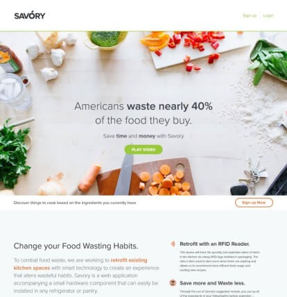
Savory
My first big web project. It was a collaborative idea to get rid of food waste without much hassle for the end user. The idea was to create an app that knew the contents of your fridge using RFID technology, by utilizing a scanner in your fridge everyday items would be scanned and pushed to a database that would know what you've had in the fridge and for what amount of time it's been in there. Using that data you could know approximate times of expirations to cut down on food waste, while also having the ability to suggest recipes based on what's in there. Since it was an app, as an added convenience you could check the contents of your fridge while out at the store.
My role in the project included building web pages, grabbing data from an api, and outputting specialized content. It was a fun and hard project that really opened my eyes to just how powerful a simple idea can be.
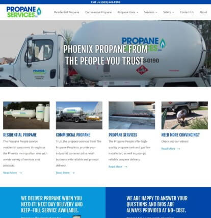
Propane Services LLC
My first official website at a company. It was tough, as the work environment was both new and difficult. Most of the work was worked on through the CMS, but some of it had to be done through SQL, which was nerve wracking. The designer was very strict with pixel perfectness on his designs, so it really helped with learning how margins, padding and borders really worked without the use of bootstrap.
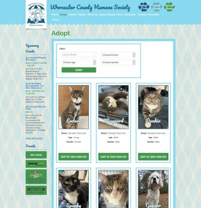
Worcester County Humane Society Sort and Filter
Created a sort and filter for pets up for adoption by the Worcester County Humane Society. I used a mix of JavaScript, JQuery, CSS, GET queries and POST queries as an exercise to learn.
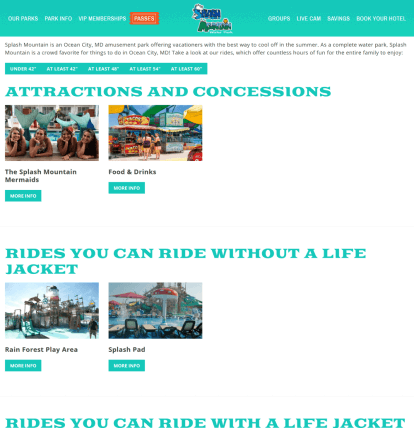
Jolly Roger Park Filter
Created a filter, and filled out the attractions for all the parks on the Jolly Roger sites. Since each park has a different set of requirements for their rides, this was a huge undertaking. It took a bit of enginuity and wordpress knowledge to get it right.
Sussex Academy
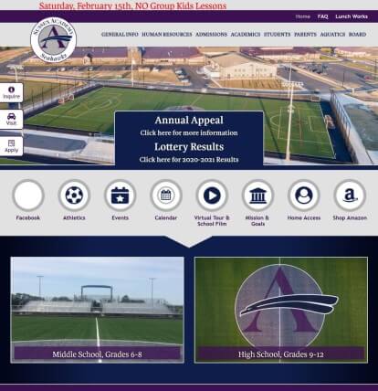
A fun idea for a college. We moved all of their documentation onto the website and kept the theme consistent between pages. Fortunately the inner page styles were simple enough to keep the formats from breaking too much.
Immanuel Shelter
An ambitious rehaul of their meager website. Techno Goober put out their annual "Ugly Website" contest, and this was the lucky winner. There were talks of creating some crazy javascript portions, like donation trackers. Unfortunately we never made it that far, but in the end everything turned out well.
Pinnacle Flooring
An interesting design combining their idea of moving forward with a modern feel. I used lots of JavaScript and CSS to keep the triangles from interfering with content.
ZZHouse
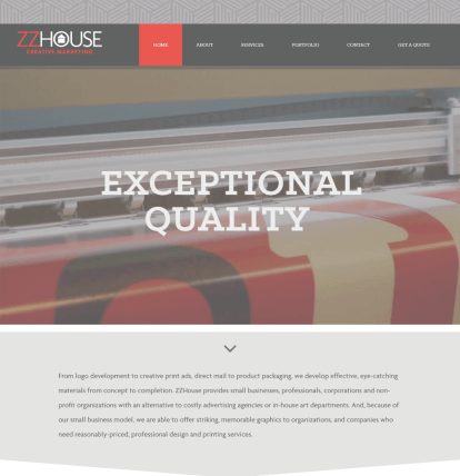
A website designed by ZZhouse themselves. Every page had a completely different design, but with the same background and colors. It was a long and difficult site, but worked out well. Eventually they moved on and created something in house.
200Deep
200Deep ended up being a project in turmoil. The owner of 200Deep switched out developers several times within 2 years. In the end they used roughly half our design, which we made work using some fancy JavaScript and CSS. The design itself utilized a lot of angles, which caused issues on various browsers and devices. It was a fun project to build and make right universally.
